
Broadminded
When laying interesting inks on the page, wider is better.

Painting with bold strokes makes a statement. So does writing with them.
Against the grain of fine nib popularity, broad nibs offer a satisfying experience for the cursive writer. Fountain pen enthusiasts are a niche-within-a-niche to begin with, so voicing a preference for even something as wide as a medium nib puts you on an island in a sea of needle points, which is just a puddle on a sidewalk paved with ballpoints and gel ink pens. Among the global fountain pen community, anecdotal evidence and pen manufacturer retail offerings have led me to conclude that fine nibs are overwhelmingly preferred over broad nibs. While my understanding of the matter may be based on apocryphal claims, certain logic supports it.
Fine nibs arguably aid writers in making their chicken scratch more legible. The narrower, controlled line of ink they put down on the page creates characters more distinct in appearance and easier to tell apart from others. Furthermore, fine nibs seem to be especially popular in Japan—home to superior fountain pen manufacturers and a nation with a stronger fountain pen culture than most—as the rendering of complex pictographic kanji characters by hand calls for a precise instrument to create all the individual little strokes. One might surmise that fine nibs are also most popular in China and Taiwan for the same reason. That clarity is also desired by those who block print in alphabets like Roman and Cyrillic.
Clean, straight lines are naturally easier to read. I would submit, though, that they are not necessarily easier to write.
What I mean by that is that laying individual, straight strokes on the page is time consuming and labor intensive in the sense that the hand is constantly making short, little marks, lifting the nib off the paper after each stroke and laying it back down to create the next in small, jerking movements. It would be far easier and faster for the nib to remain in contact with the page for the duration of creating an entire word, and for the pen to glide rather than scratch the paper’s surface.
I’m describing cursive, of course. Writing in longhand cursive is becoming more of a lost art as once-mandatory penmanship lessons for children have fallen by the wayside and keyboard use has become the standard writing mechanism. Typing is not just for the office secretarial pools of bygone days anymore; today’s tech demands typing, something I have always been lousy at.
I learned my cursive as a second grader in a course which was both compulsory and graded. Once upon a time, cursive penmanship was believed to be a necessary skill in the literate Western world. Admittedly, I lost touch with my cursive in college, preferring to print my lecture notes and term paper first drafts because it felt “easier” to print. It wasn’t really. I had just gotten used to doing it because it was the only way I could make my handwriting legible enough for those who did my typing in college, often a hired typing “service” which was actually a grad student making cash with their rare (back then) word processor, or a girlfriend who felt pity for the term-paper-procrastinator me.
I revived my cursive penmanship years later when a coworker introduced me to fountain pens. He was a fellow prosecutions officer who took notes of his interviews with suspects and witnesses with a Pelikan and let me try his pen. He taught me the basics about care and maintenance of a fountain pen in an intensive, hour-long lesson. I was seduced by the ease with which the nib glided across the page. My wrist and fingers didn’t feel the fatigue that came with using a government-issued ballpoint pen to scratch interview notes or report drafts.
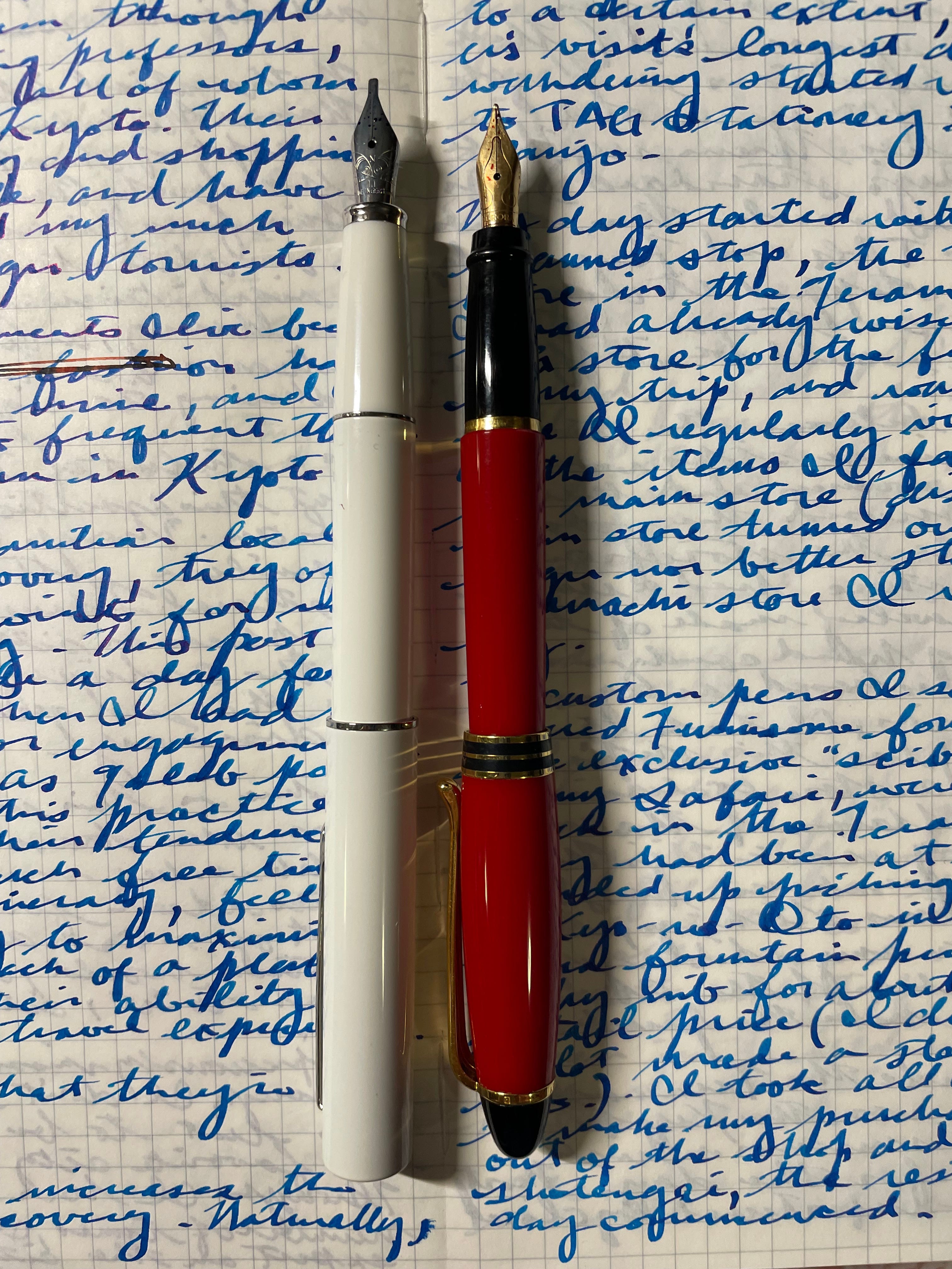
After raving at home about the experience, my wife gifted me with the nicest pen she could find on the island at the time, a Waterman Expert II with a ridiculously smooth medium steel nib in the attractive “Smart Brown” finish. I would draft my first novel, Kona Winds, with this pen, and I would do it all in cursive. From that time on, my second-grade penmanship hand came back for good.
While I do love using all my pens, including those with fine nibs (truth be told, most of the pens in my collection have fine nibs), the best experience writing in cursive by far is with broader nibs. It’s something of a trade-off: fine nib drafts are easier on my eyes when I transcribe, but broad nib drafts are more fun in their creation.
My cherished Waterman Experts with medium steel nibs lay down thick, wet lines that show off ink shading properties nicely and are an absolute pleasure to write with. When acquiring a Japanese pen these days, I will opt for a medium or “coarse” nib if I have the choice. (Often, I don’t. I find that Japanese-made pens commercially available to the U.S. market almost always come with a fine nib as a default. I’m looking at you, Sailor.) Japanese nibs run narrower than Western nibs of the same size notation, so a Japanese medium is like a German fine, and so forth.
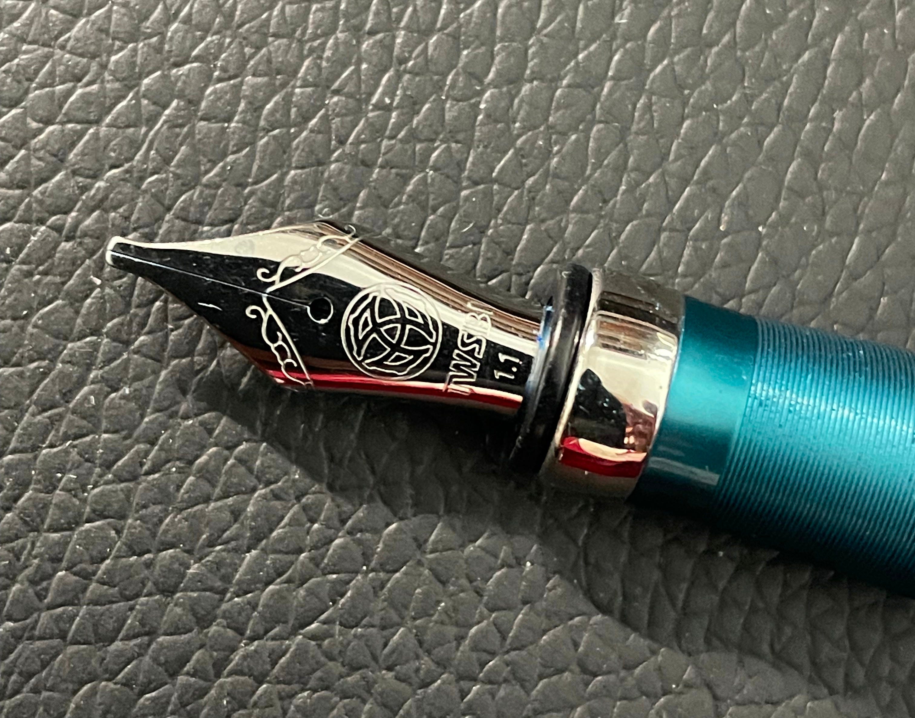
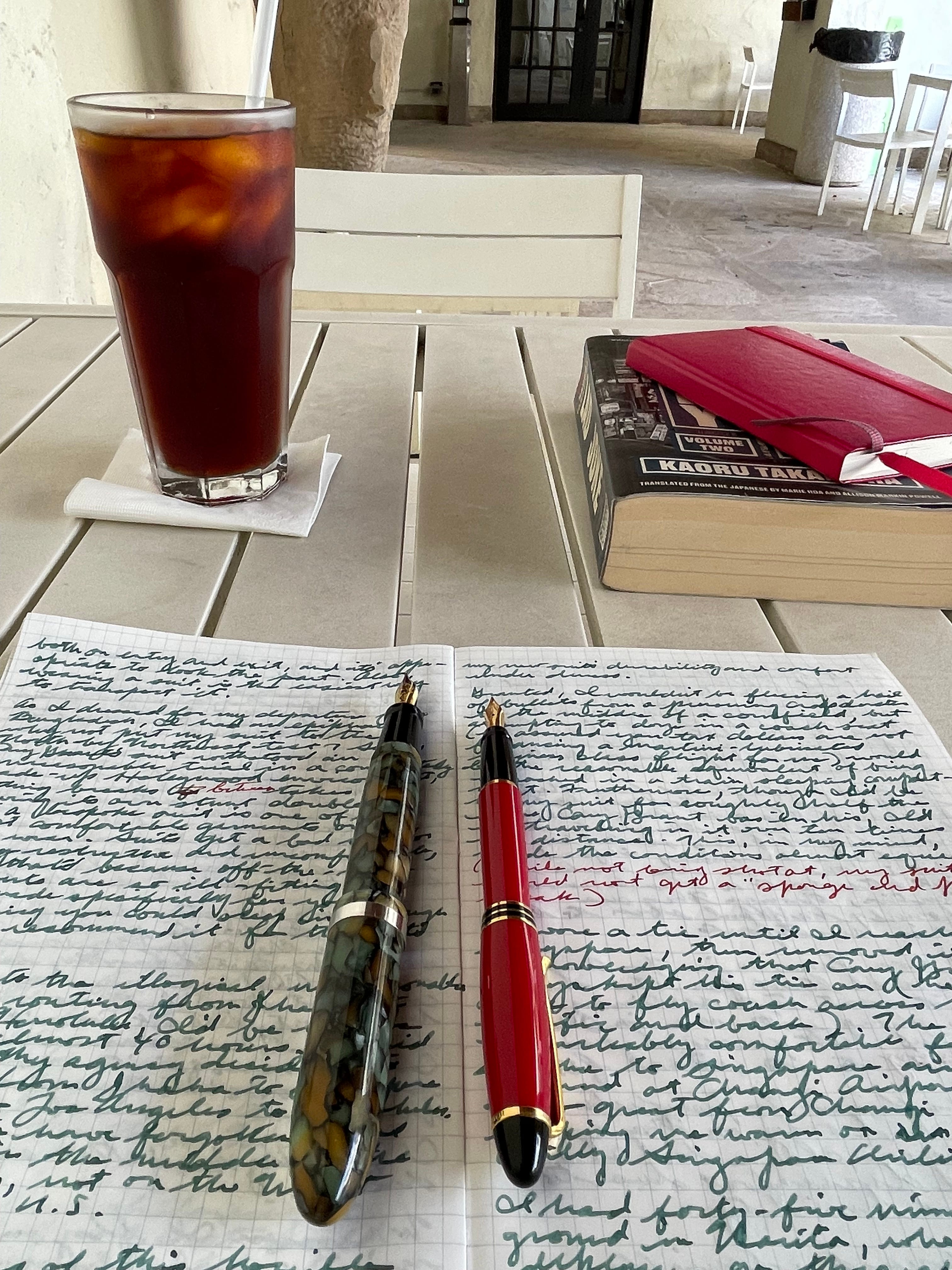
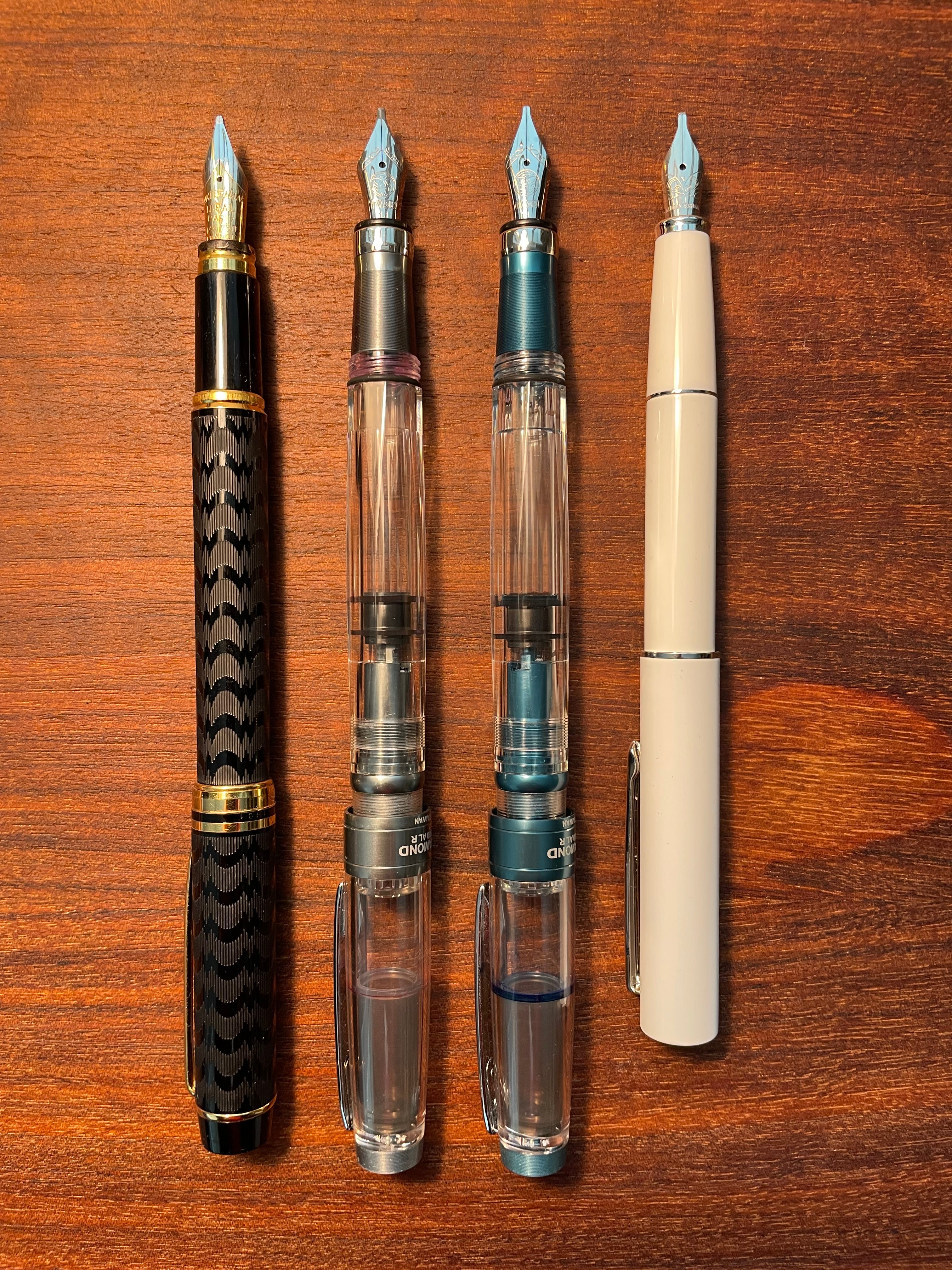
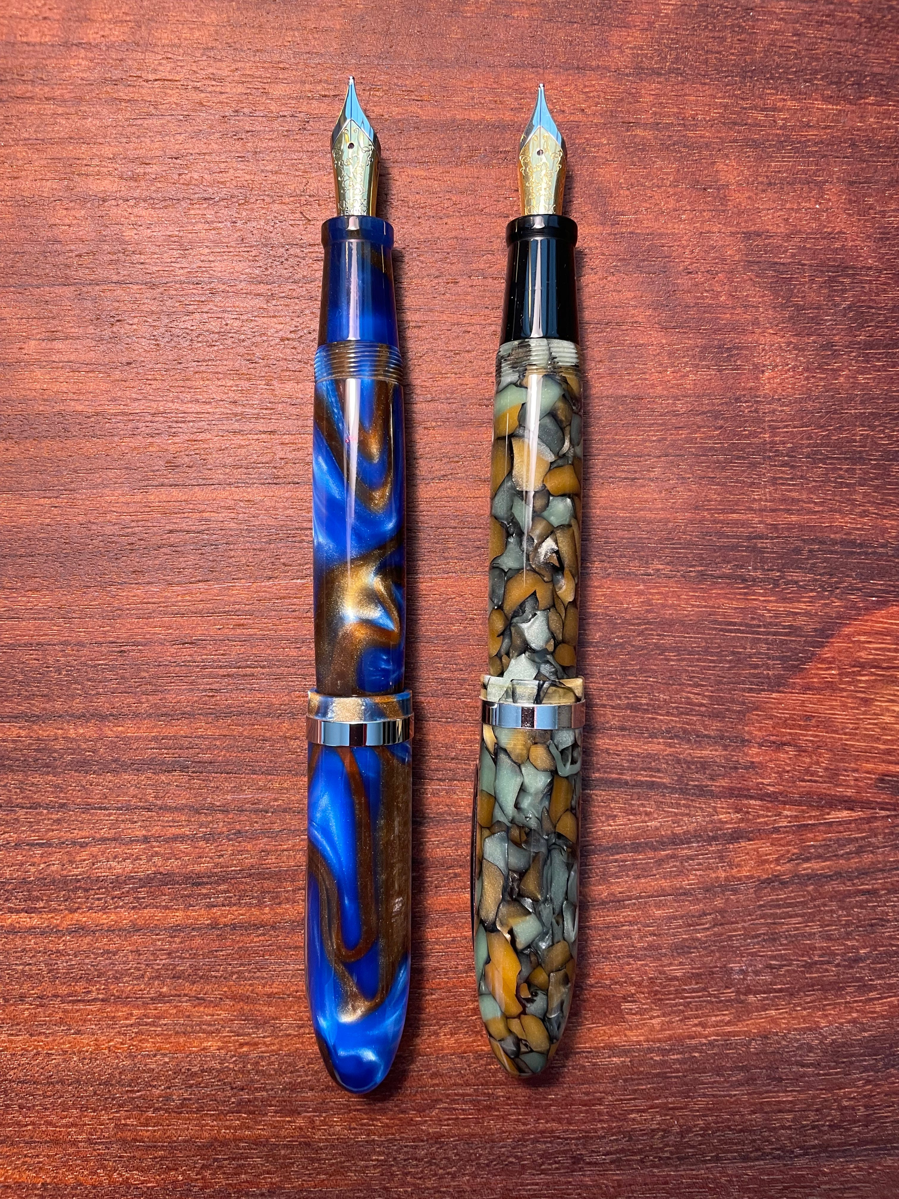
The nibs which are the most fun to write with come in sizes like the 1.1 stub. I have two TWSBI Diamond 580 ALR pens with 1.1 stub nibs and was generously gifted with a Hongdian C2 fitted with a Nemosene 1.1 stub by Andrew Wertheimer . Drew filled the converter with a stunning ink from The Wet Pen called Rainer Blue, and the generous line from the 1.1 stub nib shows off a gorgeous violet sheen on the brilliant sapphire. My “grail pen,” a Waterman Man 100 “Opera” pen, is fitted with an 18 karat gold 1.1 stub. It always delivers a smooth, wet line featuring an ink’s best properties. All these pens are among my favorites in terms of the writing experience they deliver.
Drew told me he had acquired the Nemosene 1.1 stub nib from the Birmingham Pen Company in Pittsburgh, Pennsylvania. I had not heard about this company before Drew brought it to my attention. All it took was a first visit to the site to start a string of orders. The first order from Birmingham included a Knox double broad oblique #6 steel nib, which was the only nib they had in stock. I replaced one of the stock Jowo #6 medium steel nibs in a Laban Mento in my collection with the Knox nib and filled it with Birmingham’s Pitted Nickel ink, a somber green that really looks like verdigris. I loved the writing experience and look of the lines on the page so much that I ordered another of the same nib and a different ink from Birmingham a couple of weeks later. Birmingham’s inks are stunning with wonderful sheening properties. I have a third Birmingham ink and two steel Nemosene #6 1.1 stub nibs on the way.
My December Kyoto visit yielded a Pilot Prera with a calligraphy nib. I had never seen such a thing before, and as soon as I saw it in the Teramachi Sanjo TAG Stationery store, I became nostalgic for my sixth-grade obsession with The Lord of the Rings and my college obsession with The Book of Kells. It’s sure to be fun to practice Celtic uncials again with this pen.
I have yet to explore all the other interesting nib options which only come with custom nib grind work. I think the final frontier for my broad nib exploration is the cursive italic nib. I am seeking to have my disappointingly over-polished Montblanc Meisterstück 149’s 14kt nib ground to a cursive italic by a good nib meister. This will probably elevate its status from one of my least-used pens to one of my most-used.
As with national origin, barrel size, price point and manufacturer, I use all my pens equally regardless of nib size. Each pen gives me a unique writing experience, all of them pleasurable in their own way. If I’m honest, though, I’ll say that the broader nibs offer more fun in the act of laying ink on a page.
Big is beautiful, indeed.
My pen envy grows, Scott! I largely fall on the fine to extra fine spectrum though I do find that if the nib isn’t generous enough with flow, they can be too scratchy. I have a couple medium nibs, one of my gold plated nib Pelikans, which is a buttery river as you describe but have never had the guts to go with a broad nib. But you’ve given me some research ideas. And a reminder that I am overdue for some basic maintenance on my fleet.
Great post, Scott. Happy you are so enjoying the Nemosine stub and Inky Pen ink and the like.
It's fun to enjoy the variety of nib grinds. Stubs are my favorite, but the Architect or Scribe are also favorites. Otherwise I usually go for an EF or F or even sometimes the UEF. :)
It was great to see you and the KONA WINDS mss at our Honolulu Fountain Pen Club meeting on Saturday. We were lucky that we all beat the bad weather. It's fun to learn together as a hui.
If you want to write really broad, Shak MD often has some nibs that are stacked nibs (https://shak-md.com/collections/all) Of course you can get cheaper ones too at AliExpress. It is like using a sharpie :)